css 上下 置顶,中间自由伸缩滚动

上下 置顶, 中间自由伸缩

爷爷: height: 100% 或者固定值, 不然下层都是撑开

父 :

display: flex;

flex-direction: column;

height: 100%; // 保证充满 当前容器

子:

header flex: none,

body: overflow:scroll; height: 100%; // 保证把 header footer 顶到底

footer: flex: none,

左自由,右固定

<div>  父级固定宽度, 可以为 %,或具体数值
    <div > // 设置display flex, justify-content 
          <div> // 设置 display flex  overflow: hidden 
             <div>  // 设置 文本超出身略 ellipsis </div>
             <icon> // 设置 图标固定宽度flex: 0 0 0.1rem
           </div>
           <div>  // flex: none, width: 固定宽度值
                内容
           </div>
    </div>
</div>

移动端适配解决方案

历史

一种流行已久的移动端适配方案,那就是rem,我想下面这两句代码,有不少老移动端都不会陌生:

const deviceWidth = document.documentElement.clientWidth || document.body.clientWidth;

document.querySelector('html').style.fontSize = deviceWidth / 7.5 + 'px';

在那个移动端UI稿尺寸为750*1334满天飞的时代,这两句代码确实给开发者带来了很大的方便,这样设置根font-size后,px和rem的转换比例成了100, 为比如UI稿一个长宽分别为120px*40px,那么开发者对应的写成1.2rem*0.4rem就可以了

这种换算已经是颇为方便,但是并非所有的项目都能这样去设置一个方便换算的比例系数,当比例系数为100时,小数点往前面挪两位就行了,然而有的项目设置的换算系数千奇百怪,有50的,有16的,很多已经严重超出口算力所能及的范畴了。所以后来诞生的px-to-rem或者px2rem就是为了解决这个问题

期望

  • 首先,无论换算方不方便,我都不想换算(就是这么懒?),我也不想去操心什么转换系数
  • 其次,有些属性或者类选择器我不想进行转换
  • css代码要足够简洁,我只希望看到一种单位,那就是px

第一种方案

第一种方案是lib-flexible + postcss-pxtorem,在相当长一段时间里,这两个插件搭配都是解决移动端布局的神器,lib-flexible是阿里手淘系开源的一个库,用于设置font-size,同时处理一些窗口缩放的问题。

第二种方案是viewport

postcss-px-to-viewport就是这样一款优秀的插件,它解决了以上提到的痛点,也满足以上提到的理想要求。它将px转换成视口单位vw,众所周知,vw本质上还是一种百分比单位,100vw即等于100%,即window.innerWidth

用法

  1. npm i postcss-px-to-viewport -D
  2. 在项目根目录下添加.postcssrc.js文件
  3. 添加如下配置:
module.exports = {
  plugins: {
    autoprefixer: {}, // 用来给不同的浏览器自动添加相应前缀,如-webkit-,-moz-等等
    "postcss-px-to-viewport": {
      unitToConvert: "px", // 要转化的单位
      viewportWidth: 750, // UI设计稿的宽度
      unitPrecision: 6, // 转换后的精度,即小数点位数
      propList: ["*"], // 指定转换的css属性的单位,*代表全部css属性的单位都进行转换
      viewportUnit: "vw", // 指定需要转换成的视窗单位,默认vw
      fontViewportUnit: "vw", // 指定字体需要转换成的视窗单位,默认vw
      selectorBlackList: ["wrap"], // 指定不转换为视窗单位的类名,
      minPixelValue: 1, // 默认值1,小于或等于1px则不进行转换
      mediaQuery: true, // 是否在媒体查询的css代码中也进行转换,默认false
      replace: true, // 是否转换后直接更换属性值
      exclude: [/node_modules/], // 设置忽略文件,用正则做目录名匹配
      landscape: false // 是否处理横屏情况
    }
  }
};

注意

  • propList: 当有些属性的单位我们不希望转换的时候,可以添加在数组后面,并在前面加上!号,如propList: ["*","!letter-spacing"],这表示:所有css属性的属性的单位都进行转化,除了letter-spacing
  • selectorBlackList:转换的黑名单,在黑名单里面的我们可以写入字符串,只要类名包含有这个字符串,就不会被匹配。比如selectorBlackList: ['wrap'],它表示形如wrap,my-wrap,wrapper这样的类名的单位,都不会被转换

兼容第三方UI库

开发中可能遇到一下情况,第三方库 是375px的设计稿去做的, 而自己的ui 是按 750 px 设计搞,所以我们要针对不同的 库定义不同的 viewportWidth 尺寸, 看代码

const path = require('path');

module.exports = ({ file }) => {
  const designWidth = file.dirname.includes(path.join('node_modules', 'vant')) ? 375 : 750;

  return {
    plugins: {
      autoprefixer: {},
      "postcss-px-to-viewport": {
        unitToConvert: "px",
        viewportWidth: designWidth,
        unitPrecision: 6,
        propList: ["*"],
        viewportUnit: "vw",
        fontViewportUnit: "vw",
        selectorBlackList: [],
        minPixelValue: 1,
        mediaQuery: true,
        exclude: [],
        landscape: false
      }
    }
  }

}
// 注意:这里使用path.join('node_modules', 'vant')是因为适应不同的操作系统,在mac下结果为node_modules/vant,而在windows下结果为node_modules\vant

umi postcss 其他的 一些插件


  // 额外的postcss插件用这个extraPostCSSPlugins:
  extraPostCSSPlugins: [
    postcssImport({}),
    postcssUrl({}),
    postcssAspectRatioMini({}),
    postcssWriteSvg({ utf8: false }),
    postcsscssnext({}),
    pxToViewPort({
      viewportWidth: 720, // (Number) The width of the viewport.
      viewportHeight: 1280, // (Number) The height of the viewport.
      unitPrecision: 3, // (Number) The decimal numbers to allow the REM units to grow to.
      viewportUnit: 'vw', // (String) Expected units.
      selectorBlackList: ['.ignore', '.hairlines'], // (Array) The selectors to ignore and leave as px.
      minPixelValue: 1, // (Number) Set the minimum pixel value to replace.
      mediaQuery: false // (Boolean) Allow px to be converted in media queries.
    }),
    cssnano({
      preset: "advanced",
      autoprefixer: false,
      "postcss-zindex": false,
      zindex: false
    })
  ],

css加载会造成阻塞吗

  1. css加载不会阻塞DOM树的解析
  2. css加载会阻塞DOM树的渲染
  3. css加载会阻塞后面js语句的执行

默认情况下,CSS 被视为阻塞渲染的资源,这意味着浏览器将不会渲染任何已处理的内容,直至 CSSOM 构建完毕。请务必精简您的 CSS,尽快提供它,并利用媒体类型和查询来解除对渲染的阻塞。

我们可以通过 CSS“媒体类型”和“媒体查询”来解决这类用例:

<link href="print.css" rel="stylesheet" media="print">
//,它只在打印内容时适用---或许您想重新安排布局、更改字体等等,因此在网页首次加载时,该样式表不需要阻塞渲染。
<link href="other.css" rel="stylesheet" media="(min-width: 40em)">
//样式表声明提供由浏览器执行的“媒体查询”:符合条件时,浏览器将阻塞渲染,直至样式表下载并处理完毕。

优化 CSS 发送过程

  1. 使用CDN(因为CDN会根据你的网络状况,替你挑选最近的一个具有缓存内容的节点为你提供资源,因此可以减少加载时间)
  2. 合理的使用缓存(设置cache-control,expires,以及E-tag都是不错的)
  3. 如果外部 CSS 资源较小,您可将它们直接插入到 HTML 文档中,这称为“内嵌样式”
  4. 如果 CSS 文件较大,您便需要确定和内嵌用于呈现首屏内容的 CSS,并暂缓加载其余样式,直到首屏内容显示出来为止。

如果原生的html 是这样

<html>
  <head>
    <link rel="stylesheet" href="small.css">
  </head>
  <body>
    <div class="blue">
      Hello, world!
    </div>
  </body>
</html>

那么把 本页用到的写class 写到 style, 其余的 延后加载

// inline critical CSS as follows:
<html>
  <head>
    <style>
      .blue{color:blue;}
    </style>
    </head>
  <body>
    <div class="blue">
      Hello, world!
    </div>
    <noscript id="deferred-styles">
      <link rel="stylesheet" type="text/css" href="small.css"/>
    </noscript>
    <script>
      var loadDeferredStyles = function() {
        var addStylesNode = document.getElementById("deferred-styles");
        var replacement = document.createElement("div");
        replacement.innerHTML = addStylesNode.textContent;
        document.body.appendChild(replacement)
        addStylesNode.parentElement.removeChild(addStylesNode);
      };
      var raf = window.requestAnimationFrame || window.mozRequestAnimationFrame ||
          window.webkitRequestAnimationFrame || window.msRequestAnimationFrame;
      if (raf) raf(function() { window.setTimeout(loadDeferredStyles, 0); });
      else window.addEventListener('load', loadDeferredStyles);
    </script>
  </body>
</html>

不要写 行内样式

例如 <p style=…>

 Further, inline CSS on HTML elements is blocked by default with Content Security Policy (CSP)

为什么不完全用 内嵌样式

内嵌样式 使html 变得很大 浪费网络资源,而且没有缓存, 浪费宽带

requestAnimationFrame

浏览器如面每次要重绘,就会通知requestAnimationFrame

setTimeout的执行时间并不是确定的。在Javascript中, setTimeout 任务被放进了异步队列中,只有当主线程上的任务执行完以后,才会去检查该队列里的任务是否需要开始执行,因此 setTimeout 的实际执行时间一般要比其设定的时间晚一些。

刷新频率受屏幕分辨率和屏幕尺寸的影响,因此不同设备的屏幕刷新频率可能会不同,而 setTimeout只能设置一个固定的时间间隔,这个时间不一定和屏幕的刷新时间相同

requestAnimationFrame 它能保证回调函数在屏幕每一次的刷新间隔中只被执行一次,

例子

而setTimeout每隔10ms设置图像向左移动1px, 就会出现如下绘制过程:

  • 第0ms: 屏幕未刷新,等待中,setTimeout也未执行,等待中;
  • 第10ms: 屏幕未刷新,等待中,setTimeout开始执行并设置图像属性left=1px;
  • 第16.7ms: 屏幕开始刷新,屏幕上的图像向左移动了1px, setTimeout 未执行,继续等待中;
  • 第20ms: 屏幕未刷新,等待中,setTimeout开始执行并设置left=2px;
  • 第30ms: 屏幕未刷新,等待中,setTimeout开始执行并设置left=3px;
  • 第33.4ms:屏幕开始刷新,屏幕上的图像向左移动了3px, setTimeout未执行,继续等待中;

从上面的绘制过程中可以看出,屏幕没有更新left=2px的那一帧画面,图像直接从1px的位置跳到了3px的的位置,这就是丢帧现象,这种现象就会引起动画卡顿。

scrollTop 平滑滚动效果CSS3似乎是无能为力的,还是要JS出马,势必requestAnimationFrame就可以大放异彩


var progress = 0;

//回调函数
function render() {
  progress += 1; //修改图像的位置
  if (progress < 100) { //在动画没有结束前,递归渲染 
     window.requestAnimationFrame(render); 
  } 
} 
//第一帧渲染 
window.requestAnimationFrame(render);

!!!CPU节能:使用setTimeout实现的动画,当页面被隐藏或最小化时,setTimeout 仍然在后台执行动画任务,由于此时页面处于不可见或不可用状态,刷新动画是没有意义的,完全是浪费CPU资源。

而requestAnimationFrame则完全不同,当页面处理未激活的状态下,该页面的屏幕刷新任务也会被系统暂停,因此跟着系统步伐走的requestAnimationFrame也会停止渲染,当页面被激活时,动画就从上次停留的地方继续执行,有效节省了CPU开销。

 !!!函数节流:在高频率事件(resize,scroll等)中,为了防止在一个刷新间隔内发生多次函数执行,使用requestAnimationFrame可保证每个刷新间隔内,函数只被执行一次,这样既能保证流畅性,也能更好的节省函数执行的开销。一个刷新间隔内函数执行多次时没有意义的,因为显示器每16.7ms刷新一次,多次绘制并不会在屏幕上体现出来。

css 技巧

flex 布局 最后一项 向右对齐
最后一项加 margin-left: auto;
____________________________

CSS有一个:active伪类,点击后反馈给用户点击了某一块内容,经常适用于移动端,而IOS是不支持:active的,这就需要我们在 js 中加入
document.body.addEventListener(‘touchstart’,function(){});
——————————————————————————————————

material-UI

clone 属性

!!响应式字体大小
[cc lang=”js”]const theme = createMuiTheme();

theme.typography.h1 = {
fontSize: ‘3rem’,
‘@media (min-width:600px)’: {
fontSize: ‘4.5rem’,
},
[theme.breakpoints.up(‘md’)]: {
fontSize: ‘6rem’,
},
};[/cc]

自定义变量
[cc lang=”js”]

import Checkbox from ‘@material-ui/core/Checkbox’;
import { createMuiTheme, withStyles } from ‘@material-ui/core/styles’;
import { ThemeProvider } from ‘@material-ui/styles’;
import { orange } from ‘@material-ui/core/colors’;

const styles = theme => ({
root: {
color: theme.status.danger,
‘&$checked’: {
color: theme.status.danger,
},
},
checked: {},
});

let CustomCheckbox = props => (

);

CustomCheckbox.propTypes = {
classes: PropTypes.object.isRequired,
};

CustomCheckbox = withStyles(styles)(CustomCheckbox);

const theme = createMuiTheme({
status: {
// My business variables
danger: orange[500],
},
});

function CustomStyles() {
return (


);
}

export default CustomStyles;[/cc]

****************
每个 material-ui 组件都有一个 class 类, theme 可以从写这个类,类的样式可以到组件详情里看到
当配置变量不够强大的时候,您可以使用theme的overrides来让Material-UI隐式地为您注入样式规则。 这是一个非常强大的特性。

[cc lang=”js”]const theme = createMuiTheme({
overrides: {
// Style sheet name ⚛️
MuiButton: {
// Name of the rule
text: {
// Some CSS
color: ‘white’,
},
},
},
});[/cc]
**************

css 进化史

  • 全局污染 – CSS的选择器是全局生效的,所以在class名称比较简单时,容易引起全局选择器冲突,导致样式互相影响。
  • 命名混乱 – 因为怕全局污染,所以日常起class名称时会尽量加长,这样不容易重复,但当项目由多人维护时,很容易导致命名风格不统一。
  • 样式重用困难 – 有时虽然知道项目上已有一些相似的样式,但因为怕互相影响,不敢重用。
  • 代码冗余 – 由于样式重用的困难性等问题,导致代码冗余。


在CSS的进化历史上,出现过各种各样的框架致力于解决以上的问题:

  • SASS, LESS – 提供了变量、简单函数、运算、继承等,扩展性、重用性都有了很大的提升,解决了一些样式重用冗余的问题,但是对于命名混乱问题的效果不大。
  • BEM (.block__element–modifier) – 比较流行的class命名规则,部分解决了命名混乱和全局污染的问题,但class定义起来还是不太方便,比较冗长,而且和第三方库的命名还是有可能冲突。
  • CSS Modules – 模块化CSS,将CSS文件以模块的形式引入到JavaScript里,基本上解决了全局污染、命名混乱、样式重用和冗余的问题,但CSS有嵌套结构的限制(只能一层),也无法方便的在CSS和JavaScript之间共享变量。(compose: classname 可以在里嵌套一层)

css Moduel例子了解

[cc ]
****/components
*********/Button
*************Button.js
*************styles.css

// styles.css
.red {
font-size: 25px;
background-color: red;
color: white;
}

// Button.js file
import React from ‘react’
import btn from ‘./styles.css’

export default class CoolButton extends React.Component {
render() {
return (

)
}
}
[/cc]

流行框架介绍

现在随着组件化概念的流行,对从组件层面维护CSS样式的需求日益增大,CSS-in-JS就是在组件内部使用JavaScript对CSS进行了抽象,可以对其声明和加以维护。这样不仅降低了编写CSS样式带来的风险,也让开发变得更加轻松。它和CSS Modules的区别是不再需要CSS样式文件。

先来看看下载量最高的styled-component的代码风格:


内容高度不够时,footer 依然显示到最下面

1. 用flex 解决
[cc]

html {
height: 100%;
}
$footer-height: 30px;
body {
min-height: 100%;
display: flex;
flex-direction: column;
}
#content {
flex: 1;
}

#footer {
line-height: $footer-height;
text-align: center;
}[/cc]
2 padding-bottom margin-top
[cc]
html, body {
height: 100%;
}
$footer-height: 30px;
#content {
min-height: 100%;
margin-bottom: -$footer-height;
padding-bottom: $footer-height;
// requires box-sizing: border-box;
// 下面的不需要 border-box
/*
&::after {
content: ”;
display: block;
height: $footer-height; // footer height
}
*/
}

#footer {
line-height: $footer-height;
text-align: center;
}
或者
#content {
min-height: 100%;
padding-bottom: $footer-height;
}

#footer {
height:$footer-height;
line-height: $footer-height;
text-align: center;
margin-top: -$footer-height;
}

[/cc]

BEM 规范

BEM 避免 选择器嵌套, 不然不可复用
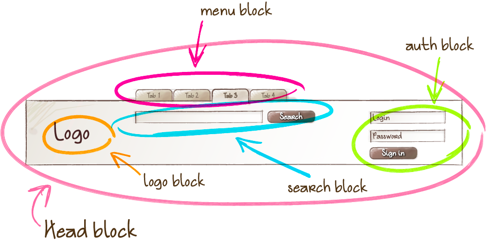
block
目的让 the logo and the authorization form 互相交换位置而不通过css 和js
1. Block: 通过class 设置块,是有意义的
不能影响它的环境,不能设置它的形状 边距等
[cc lang=”html”]

[/cc]
Block nesting 嵌套
可以嵌套 且可以嵌套多层
[cc lang=”html”]

[/cc]

2.Element
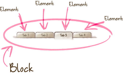
element
A composite part of a block that can’t be used separately from it.
Features:

The element name describes its purpose (“What is this?” — item, text, etc.), not its state (“What type, or what does it look like?” — red, big, etc.).

The structure of an element’s full name is block-name__element-name. The element name is separated from the block name with a double underscore (__).

[cc lang=”html”]


[/cc]
element nesting 元素嵌套
An element is always part of a block, not another element. This means that element names can’t define a hierarchy such as block__elem1__elem2.
[cc lang=”html”]


[/cc]
块是定义一个作用域, 确保所有元素element 在block的前缀之下, block__element 一定在 block 包围里

Not all blocks have elements. An element is an optional block component. 元素是个可选择的块
[cc lang=”html”]


[/cc]

Should I create a block or an element?
Create a block
If a section of code might be reused and it doesn’t depend on other page components being implemented.

Create an element
If a section of code can’t be used separately without the parent entity (the block).
The exception is elements that must be divided into smaller parts – subelements – in order to simplify development. In the BEM methodology, you can’t create elements of elements. In a case like this, instead of creating an element, you need to create a service block.

3.Modifier
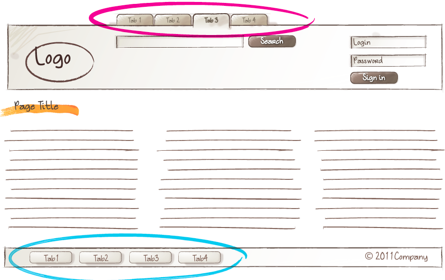
modifier
The same block looks different due to the use of a modifier.
An entity that defines the appearance, state, or behavior of a block or element.
Features:

The modifier name describes its appearance (“What size?” or “Which theme?” and so on — size_s or theme_islands), its state (“How is it different from the others?” — disabled, focused, etc.) and its
以 _ 做分离
[cc lang=”html”]


[/cc]

Key-value
Used when the modifier value is important. For example, “a menu with the islands design theme”: menu_theme_islands.

The structure of the modifier’s full name follows the pattern:

block-name_modifier-name_modifier-value

block-name__element-name_modifier-name_modifier-value
[cc lang=”html”]


[/cc]

A modifier can’t be used alone,
[cc lang=”html”]correct

incorrent

[/cc]

BEM entity
Blocks, elements, and modifiers are all called BEM entities.

Mix
A technique for using different BEM entities on a single DOM node.

Mixes allow you to:
Combine the behavior and styles of multiple entities without duplicating code.
Create semantically new UI components based on existing ones.
Example
[cc lang=”html”]

[/cc]

File structure
[cc]search-form/ # Directory of the search-form

__input/ # Subdirectory of the search-form__input
search-form__input.css # CSS implementation of the
# search-form__input element
search-form__input.js # JavaScript implementation of the
# search-form__input element

__button/ # Subdirectory of the search-form__button
# element
search-form__button.css
search-form__button.js

_theme/ # Subdirectory of the search-form_theme
# modifier
search-form_theme_islands.css # CSS implementation of the search-form block
# that has the theme modifier with the value
# islands
search-form_theme_lite.css # CSS implementation of the search-form block
# that has the theme modifier with the value
# lite

search-form.css # CSS implementation of the search-form block
search-form.js # JavaScript implementation of the
# search-form block[/cc]

BEM tree
Let’s consider an example of a DOM tree:
[cc lang=”html”]


[/cc]
BEM xml

[cc lang=”xml”]


[/cc]

HTML implementation:
[cc lang=”html”]
//Positioning a block relative to other blocks


CSS implementation:

.page__header {
padding: 20px;
}

.page__footer {
padding: 50px;
}
[/cc]
Positioning elements inside a block
[cc lang=”html”]


CSS implementation:

.page__inner {
margin-right: auto;
margin-left: auto;
width: 960px;
}[/cc]

Naming 命名
[cc lang=”html”].button {}
.button__icon {}
.button__text {}
.button_theme_islands {}
[/cc]

Using HTML wrappers 使用包装
[cc lang=”html”]Positioning a block relative to other blocks


Positioning HTML elements inside a block

[/cc]